Thursday 22 October 2009

Cake Box...

I have started looking at the types of packaging that I can create for the cakes and other products from Cake&Co.

I want to create packaging that is;
totally practical for each individual product
  • cheap to produce, as the goods have a short shelf life, and the packaging will end up in the bin pretty quickly
  • clever and different from what you might expect
  • I have been focusing initially on the individual cupcake box. This box needs to be well designed so that the cake is enclosed and cannot slide around, big enough so that the cake is not squashed, and tall so that the icing is not crushed when the box is closed.

    I have been looking at suitable shapes, and produced these mock-ups as options for the cupcake box...they are all thiner at the bottom to help stop the cake moving around, and wider at the top to protect the icing...


    Crit Feedback...

    We had a crit on Wednesday, and I was able to get feedback on all 3 of the briefs I have started as well as the collaborative brief that I am doing with Sara. These are the basic notes that I made whist the feedback was being given;

    Sustainable Packaging Brief...
    - First hand research - go to Boots and look at what is on the shelf next to the products I am redesigning.
    - Layout of the text - make it clearer
    - Stock test - how will the stock/materials improve the personality of the products
    - Might I include imagery?
    - Find a happy medium with the type, not too overlapped or spaced out
    - Plain bottles and simple colours works well
    - Keep the design clear and clean
    - Needs to feel more expert and crisp

    Branding...
    - Logo works well
    - The colour palette is well chosen and hints at a retro-ish theme
    - Use the logo within the doily shape, green circle with brown edge

    Type & Product...
    - Woodblock design with highlighted lyrics is the most popular
    - Work with the order of the words on the digitally produced designs
    - Lyric designs are less obviously christmas, less cliche
    - Make the woodblock designs a little less distressed, not so gothic
    - More white space - the design should not touch the edges of the cards
    - Colour combinations are a good choice
    - Gold/Silver accent will make the design pop, and not overpower with too much colour or glitter

    I am going to devise an Action Plan that will relate to each of the points made in the crit, as well as the areas I feel I need to develop/ explore and design in. I also need to plan time around letterpress development and screen printing my outcomes.
    The action plan will start on the first day back after the reading week (scheduled for next week).

    Wednesday 21 October 2009

    Card Stock...

    I have started to consider what kinds of paper stock I am going to use for the christmas cards and wrapping paper etc. Stock can be an integral part of the overall design and is really important to getting the tone of voice for a design right.

    I am thinking that the cards should be printed onto some sort of heavy cartridge paper, possibly water colour, but definitely something with texture or grain in it. I think that this will add to the letterpress/woodblock design of the card, and enhance the hand made feel.

    The wrapping paper could be of similar stock, probably thinner, but still using a textured/pulp paper, but I am also considering using brown paper. A couple of years ago I bought some beautiful christmas wrap that was basic brown paper with a repeat pattern of reindeer silhouettes printed on it in gold. The contrast between the 'cheap' brown paper and the expensive printed finish created a strange but beautiful design that made the paper feel really special. I think that this design worked because it wasn't too over the top with lots of metallics or glossy texture, but 2 very simple and contrasting elements. When I come to screen printing the paper I will try using brown paper, white paper and possibly some tissue paper, as well as more textured stock.

    This is a digital mock up of how the brown paper might look with black and gold printing...

    Tuesday 20 October 2009

    Work in progress...

    This is some of our work from today, general work in progress stuff of how we have begun setting up the document.
    We have hit a few snags - not having some of the content, and also having to make decisions between photos because we do not have a set up that allows more than one full image on any double page spread (we feel this may clutter, and make the brochure more like a photo album).


    Public Art Progress...

    The deadline for the this brief is the 2nd November. This is the first day back after our reading, for which Sara and I have already made other plans involving dissertation work, and visiting family, so we only have one week to complete the brief, rather than two weeks.

    Today we began developing our work, having looked at it individually over the weekend. We created several master layout pages, and started our document from scratch. We have made good headway today with the content of each page, and which layout they will use. We have also been through all of the images Vanessa gave us and chosen a few we really like to fill in some of the gaps in the document.

    These are our master layouts; every page of the document will be based on one of these set-ups, though sometimes the layouts may need to be combined to create enough space for the large amounts of text some of the pages carry.


    Monday 19 October 2009

    Cake&Co...

    I have been working hard on the logo for the Cake&Co. branding brief. I have been working mainly on printed work and looking to see how the colours come out.

    Below is the 'final logo' that I will be using to develop the packaging, and other materials I have been asked to produce. I realise that the logo design may change over the course of the rest of this project, but it will be along the lines of this design, and probably use many of the same elements. I feel that I am ready to move on, and focus on other areas of the brief, and use this design to do so.

    Design Formats...

    I have been considering what formats I need to create my designs for. I have identified several card sizes that would be viable options for production, as well as wrap and gift bags ideas.

    Sunday 18 October 2009

    Flow chart development...

    We submitted the boards last week, and Sara and I have been selected as one of three to submit a full proposal in two weeks time, and one of these will be selected as the final design.
    We have been asked to develop our flow chart into something less linear and structured, something more organic and random. These are my initial developments:


    Friday 16 October 2009

    Card Mock-ups...

    These are a few basic mock-ups that I have produced to get a feel of how the cards would be viewed. These have been digitally printed but the intention is that they will be screen printed, and the brown-ish colour will be gold.

    Wednesday 14 October 2009

    Action plan - Post show&tell...

    Sustainable Packaging
    • Strengths in development – huge experimentation
    • Range of visuals is exciting
    • Consider how the product is going to be used/received
    • Thin and thick typeface creates value
    • Good understanding of target audience
    • Pastel, softer colours – more variations
    • Different colour for each section

    Cake&Co.
    • Great design development, icing colours much more inviting to kids
    • Fun and exciting, use the ‘cute’ playful images
    • Use the utensils for the ‘get involved’ section of the company, encourage adults
    • Not a serif font – sans serif is more playful and less corporate

    Type & Product
    • Nice to see printed in a more experimental way (screen print)
    • Letterpress – rework and scan in?
    • Imagery? Hand illustrations?
    • Incorporate more colours
    • Paper stock?
    • Consider which words should be larger that others? Scale?

    Question Feedback...

    This is the feedback from the questions I asked in 'our show & tell' session today. I am quite pleased with the feedback, but I feel that some of it is slightly off the track that I am going down. The two sets of feedback that I got are a little contradictory to each other, so I feel I need to explore all of my initial developments further, and hopefully I will get something more definitive in the crit next week.


    Friday 9 October 2009

    Submission Boards...

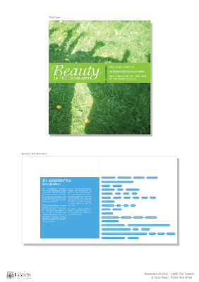
    These are the boards we are submitting to the city council as our proposal for the brochure. Sara and I have worked together to find a good balance between image and text, and included strong bold colours to keep to document interesting. The flow chart we have selected is very linear, and follows the order of the steps exactly. We hope that our design is well received and that ours will be chosen, though we know that we have very stiff competition.


    Wednesday 7 October 2009

    Individual cover development...

    These are my initial ideas for the cover of the brochure. The image is not the one that will be used in the final design, as this is yet to be decided on, so I have chosen this one because it is bright and bold.
    The information required for the cover is quite extensive, there are 3 subtitles, and one main title. The back cover will need to include the Leeds City Council logo, and probably some other written information.


    Initial flow charts...

    One of the deliverables for the Leeds Public Arts proposal is an example flow chart. We know that the flow chart needs to be strong and bold, and show the information clearly. These are my individual designs for the flow chart, which will be developed further to find a suitable final outcome.


    Monday 5 October 2009

    A Public Arts Strategy...

    These are my initial layout ideas for the brochure. It was made very clear to us that the design should be engaging and colourful and the images should be made a focus of the design.

    I am working on this brief with Sara, and we have been working on our initial ideas individually, and we are going to bring our ideas together to find a suitable balance.